Emigre: TypeCon 2027
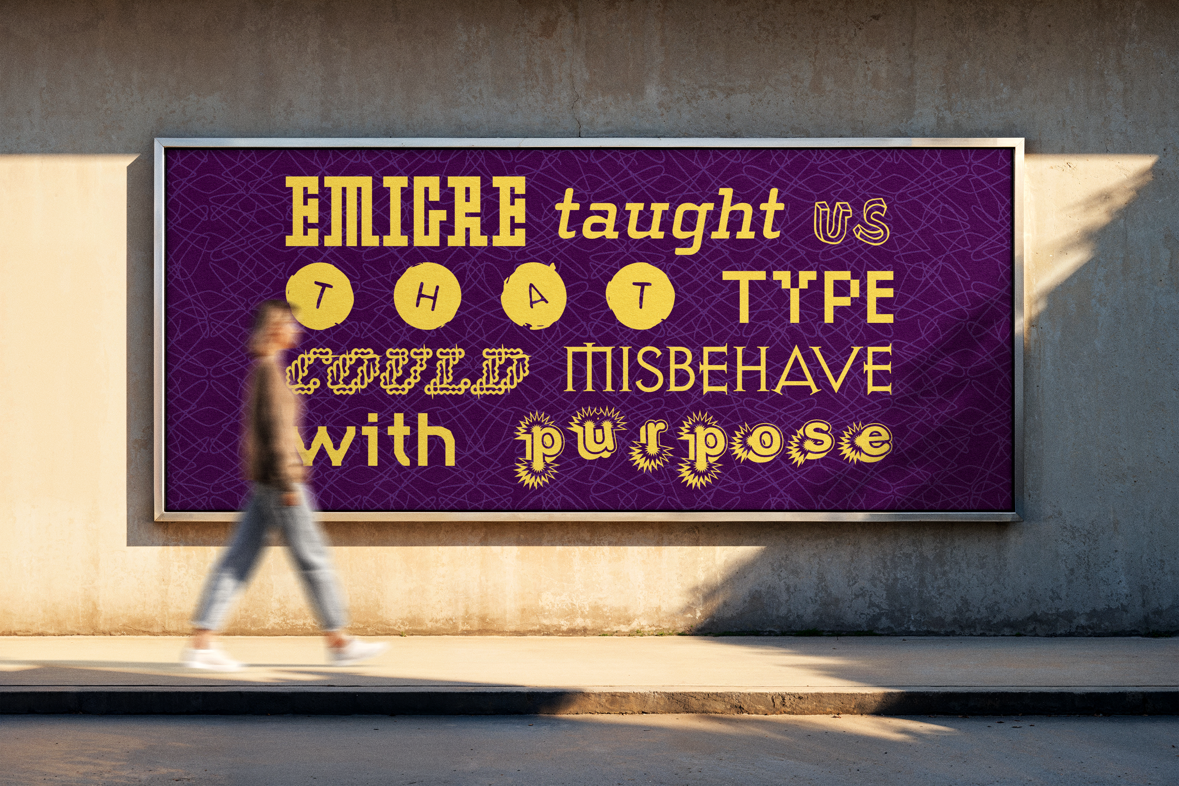
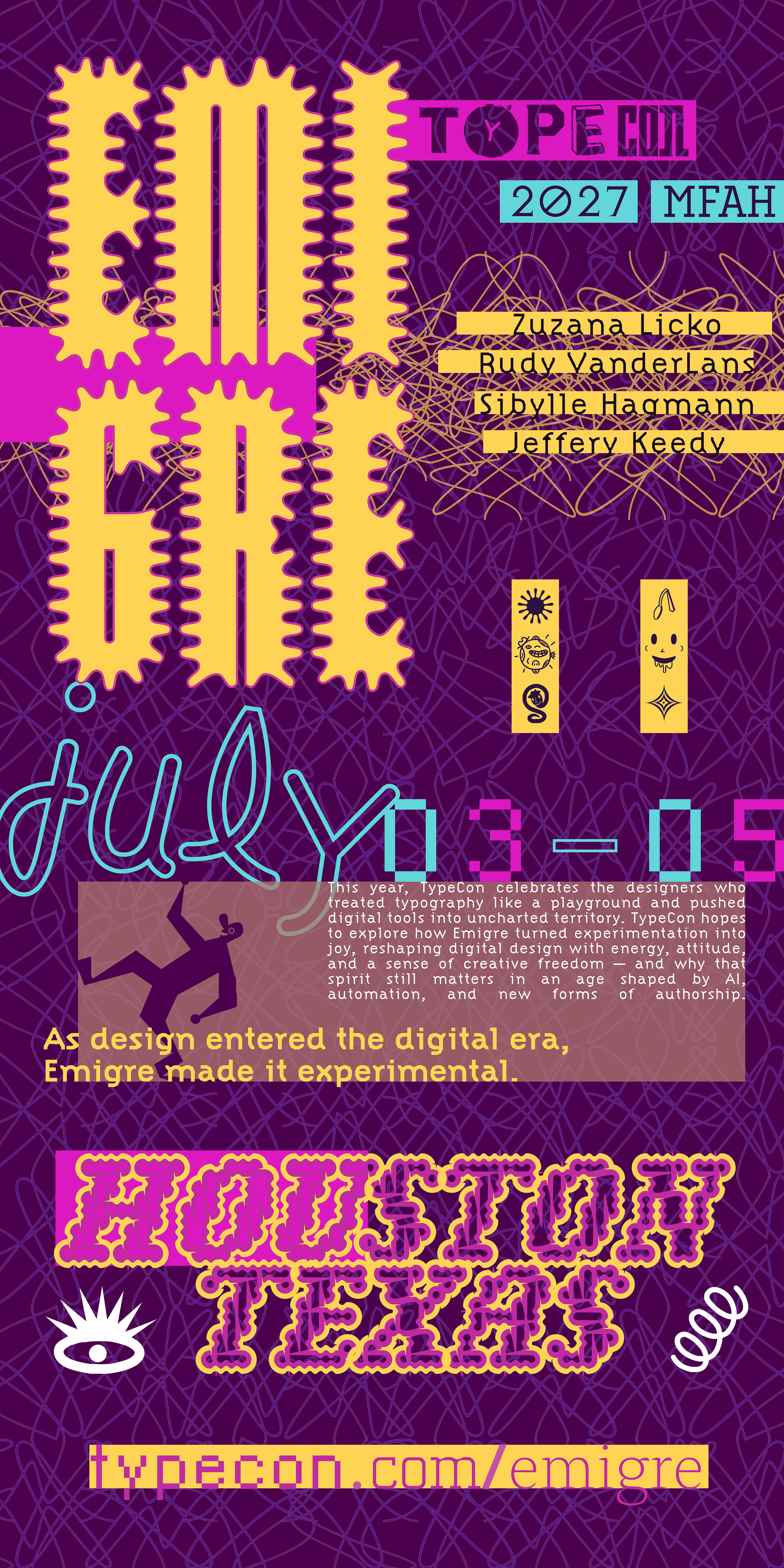
Emigre emerged during a pivotal moment in graphic design history when digital technology began transforming the possibilities of typography, publishing, and visual communication. Rather than resisting this shift, Emigre embraced experimentation as a method of discovery, challenging the rigid conventions that had long defined typographic practice. Through distorted forms, unconventional layouts, layered compositions, and highly expressive type systems, the publication became a defining voice of postmodern graphic design and helped redefine how typography could function beyond strict modernist structure. This project draws directly from that philosophy, positioning TypeCon 2027 as a celebration of experimentation, disruption, and the evolving relationship between technology and typography.
The identity system explores the idea that type can misbehave while still remaining communicative. Instead of relying on perfect alignment or predictable hierarchy, the compositions intentionally create tension through compressed spacing, fragmented forms, overlapping textures, and conflicting typographic voices. The visual language embraces instability as an expressive tool, allowing each application to feel energetic, loud, and slightly unpredictable while still functioning cohesively as part of a unified system. The result reflects the same spirit of curiosity and rule-breaking that defined Emigre’s impact on contemporary design culture.
A highly saturated palette paired with layered graphic textures reinforces the project’s sense of visual intensity and digital experimentation. Repeating patterns and distorted type treatments reference the aesthetic qualities of early digital publishing while reinterpreting them through a contemporary lens. Every design decision was intended to create movement, friction, and rhythm across the compositions, encouraging viewers to engage with the typography as both language and image simultaneously.
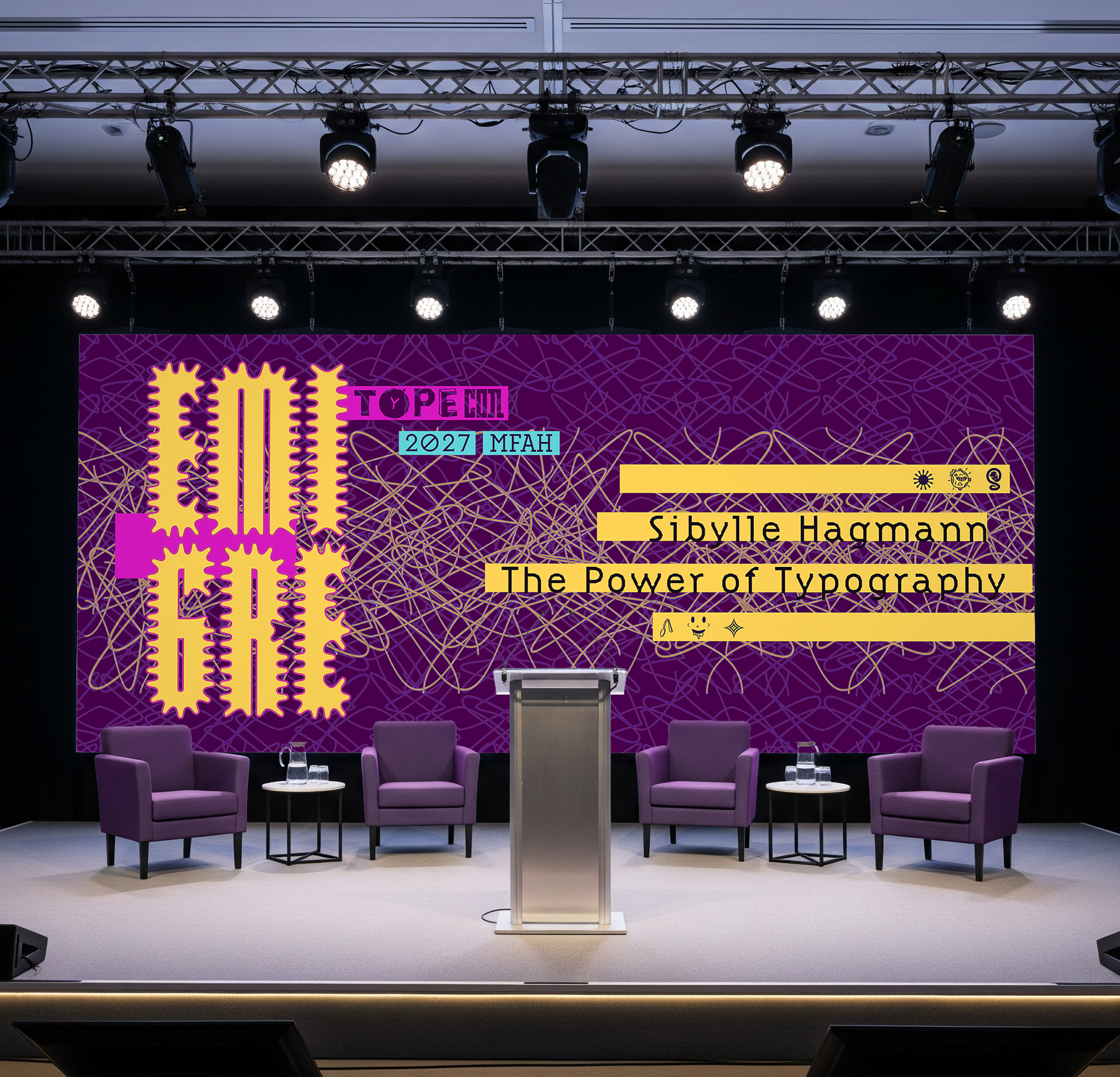
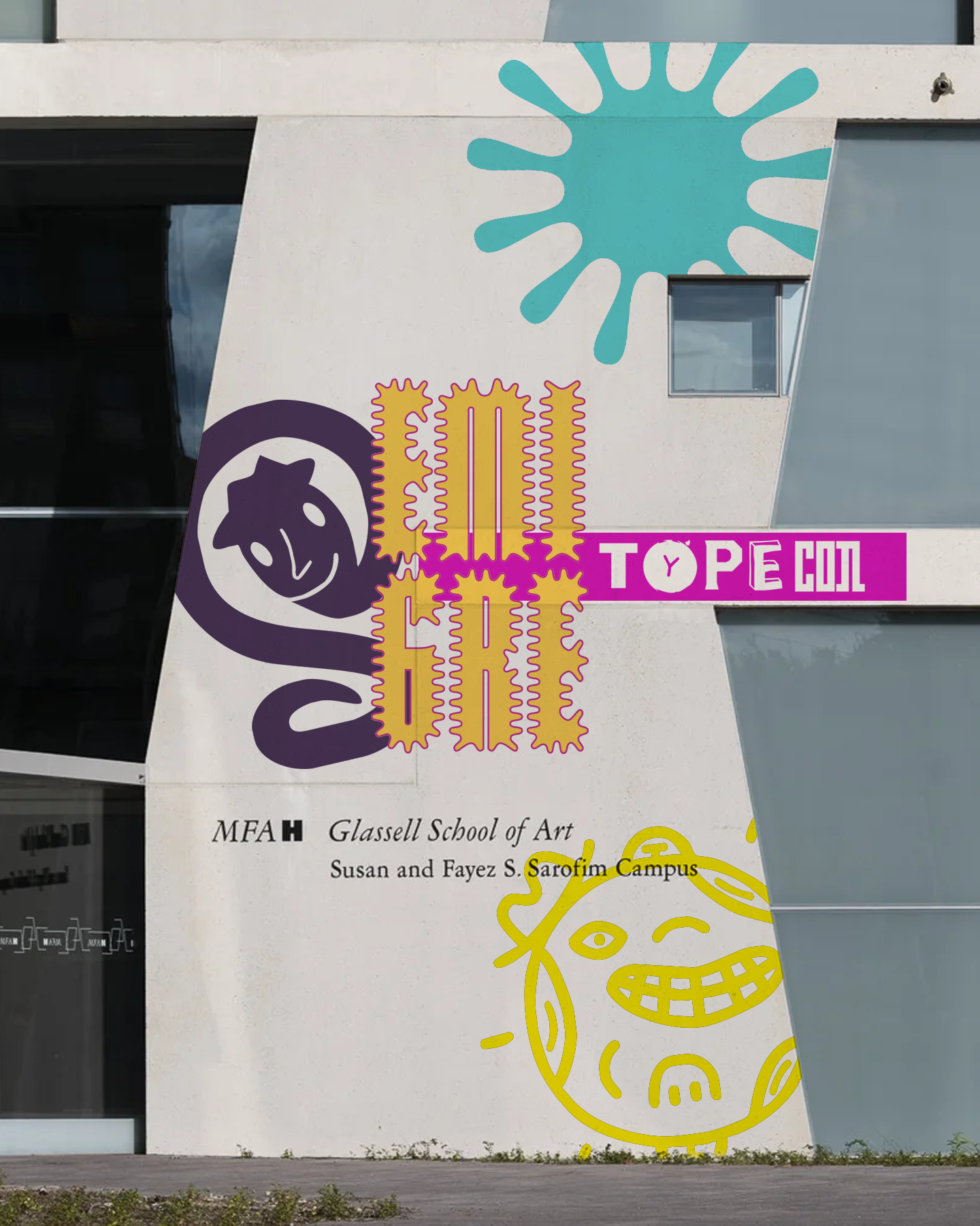
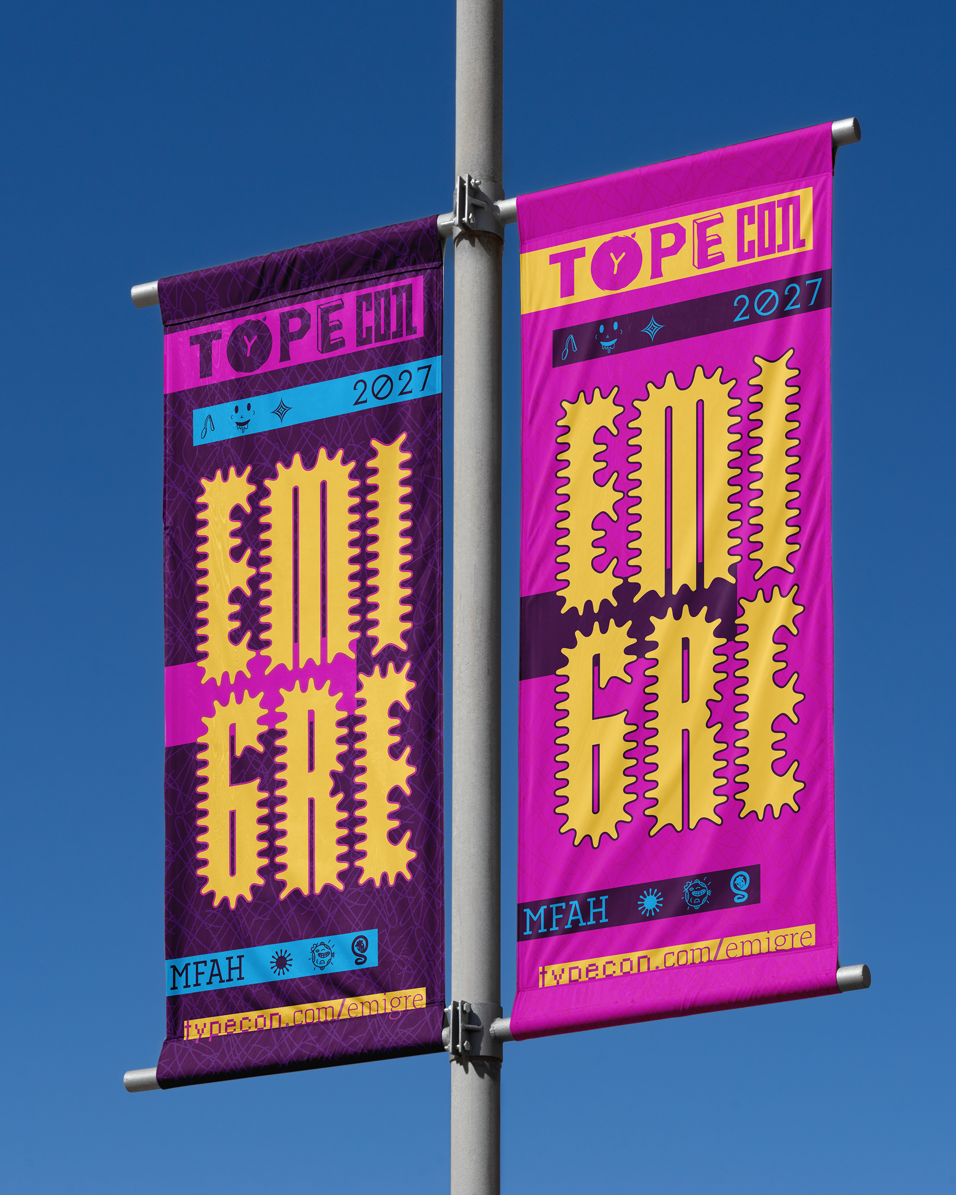
The system extends across large-scale environmental graphics, stage visuals, promotional posters, wayfinding banners, and printed event collateral. Despite the diversity of formats, the identity maintains consistency through its recurring visual motifs, expressive typographic behavior, and bold color relationships. By translating Emigre’s experimental philosophy into a contemporary conference experience, the project celebrates typography not simply as a tool for communication, but as an evolving medium capable of expression, disruption, and cultural commentary.
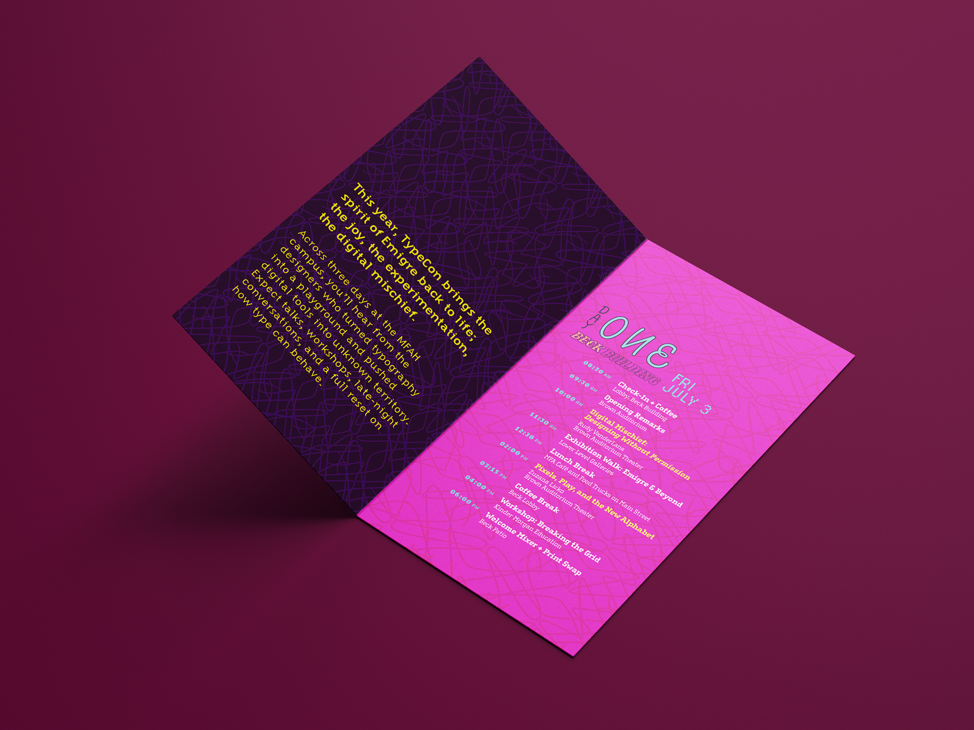
The printed program extends the visual identity into a tactile format that supports both functionality and experimentation. Layered typography, unconventional hierarchy, and saturated color relationships transform the schedule into more than informational material — it becomes part of the overall experience of the conference itself. By balancing legibility with expressive composition, the publication reflects Emigre’s legacy of pushing typography beyond passive communication into something immersive and culturally charged.