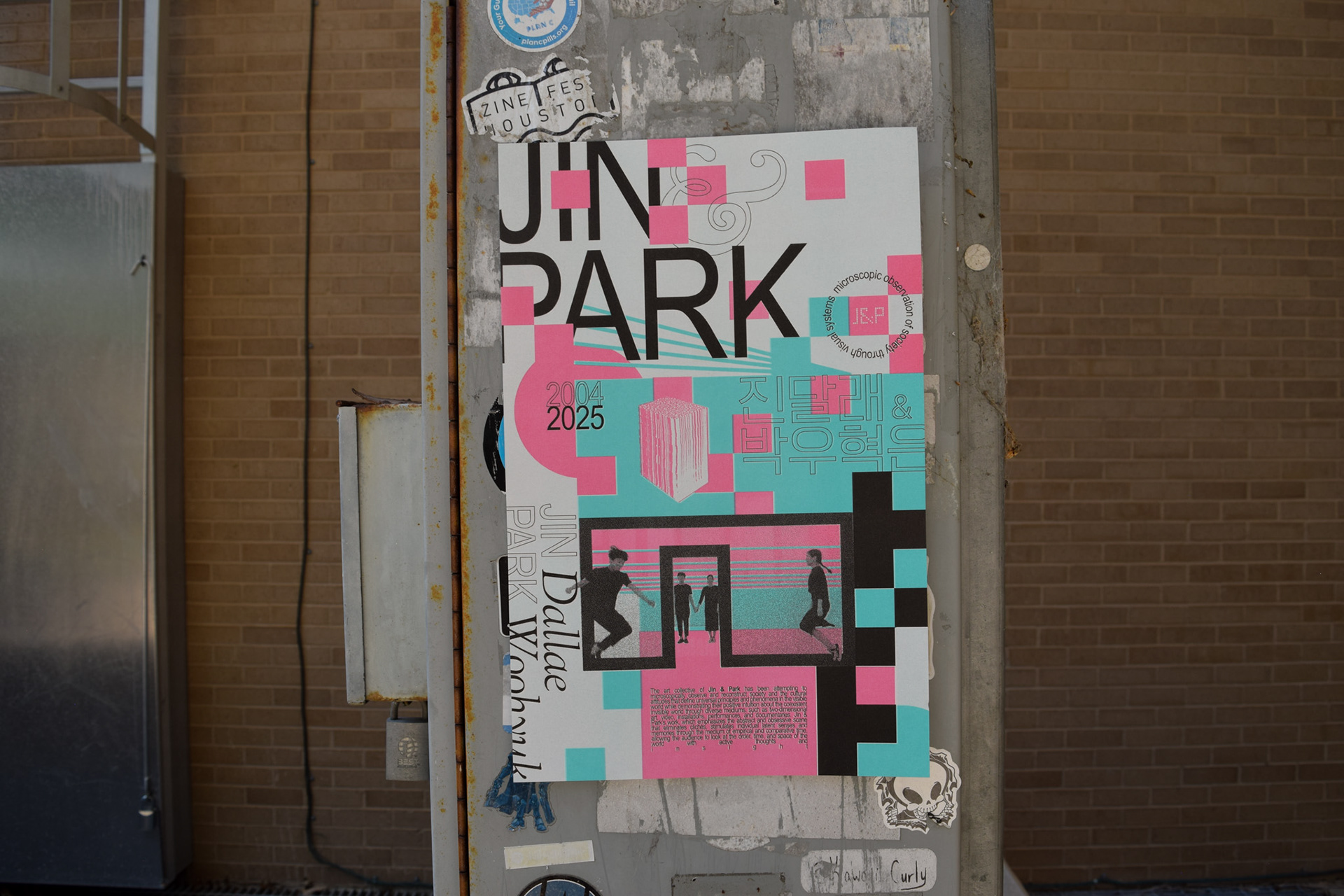
The Jin & Park poster was created as part of a research-based exploration of international graphic design practices, focusing on designers whose work falls outside the traditional Western-centered canon of graphic design history. Assigned to research the South Korean design duo, the project consisted of both a visual presentation and a three-color risograph poster system designed to interpret their formal language, design philosophy, and typographic approach.
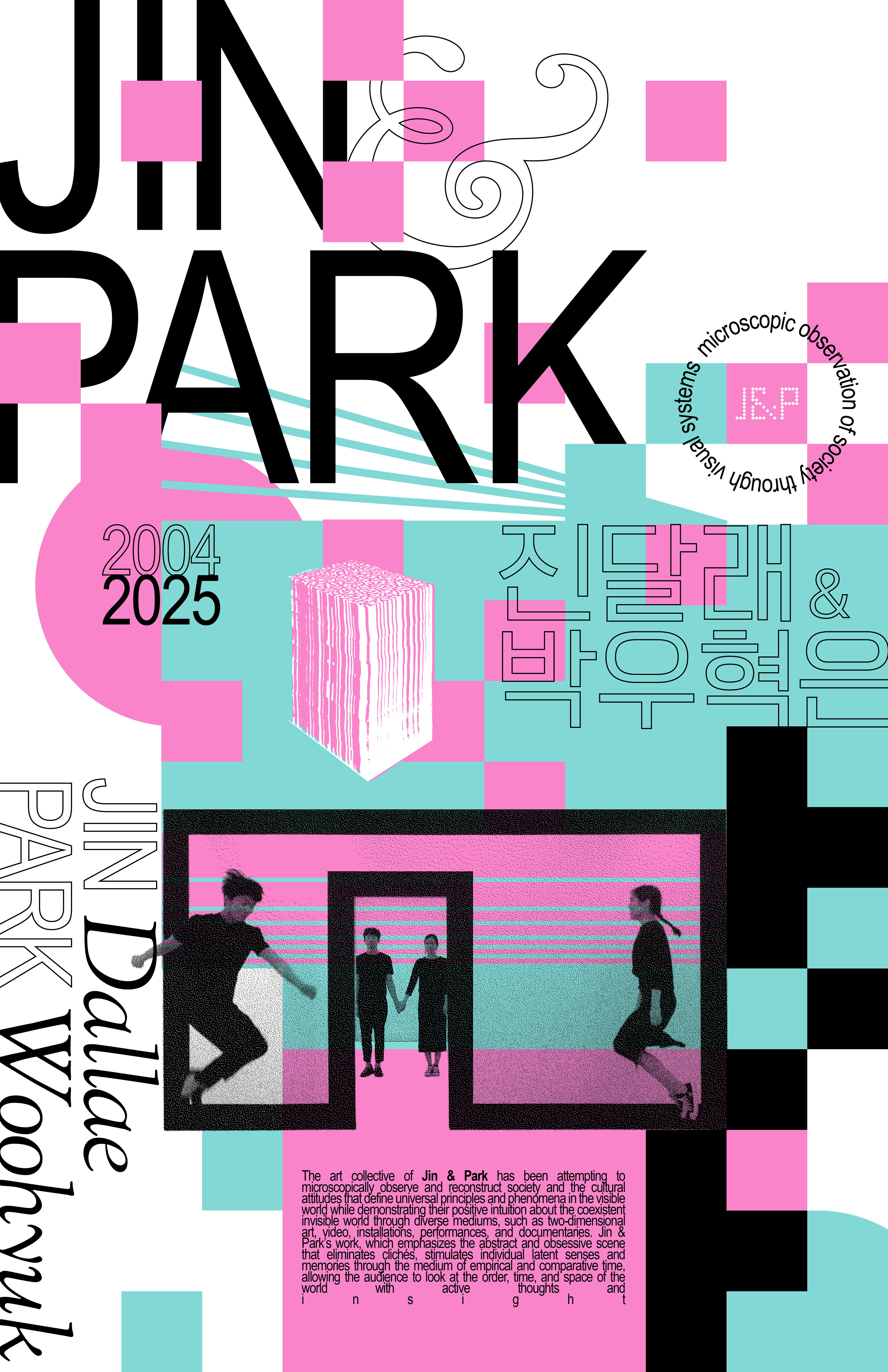
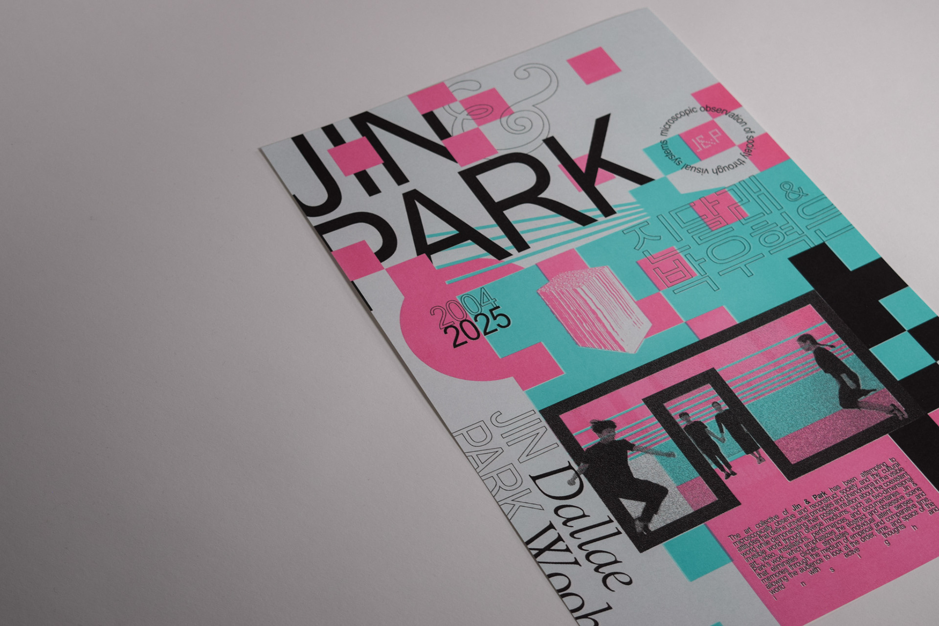
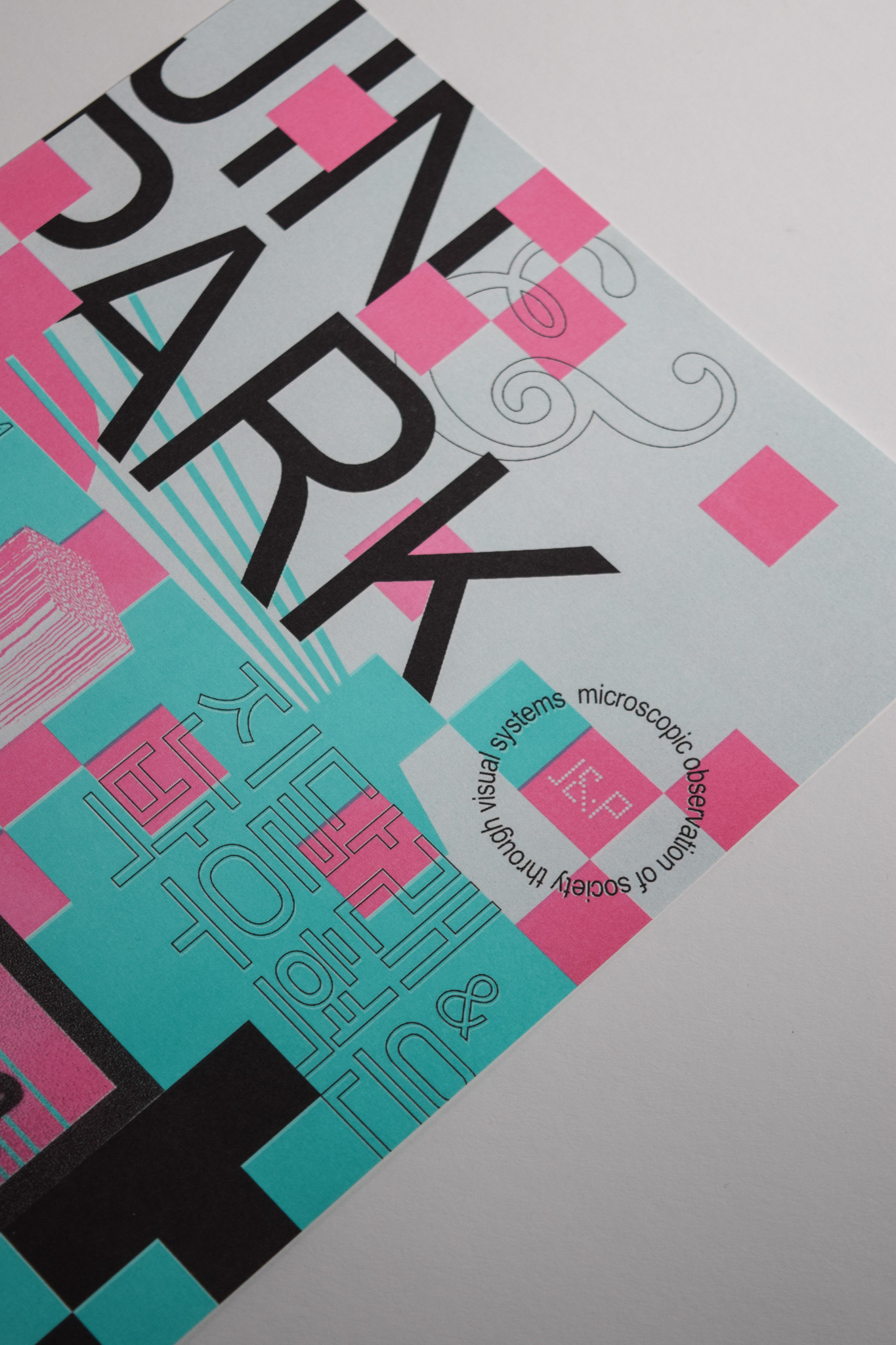
I wanted to explore the relationship between structure and disruption — a recurring characteristic within Jin & Park’s compositions. Grid systems were intentionally manipulated through fragmentation, overlapping forms, shifting typographic hierarchy, and layered imagery to create a sense of controlled instability. Large-scale typography functions both as information and as an image, allowing the poster to communicate visually before it is fully read. By balancing moments of precision with expressive visual interruption, the compositions attempt to capture the tension and movement present within the duo’s work.