KNZ Car Care

KNZ Car Care, an established auto body shop located in Southwest Houston since 1996, sought to reposition itself from general auto services to a specialized provider focused exclusively on European auto care. The primary objective was to elevate their brand identity to better reflect their expertise, attracting a clientele who values specialized, premium automotive service.
To support this vision, I developed a cohesive visual identity system including a distinctive logomark, business cards, signage, and comprehensive branding elements that align with KNZ’s refined market positioning and appeal directly to the European automotive enthusiast.


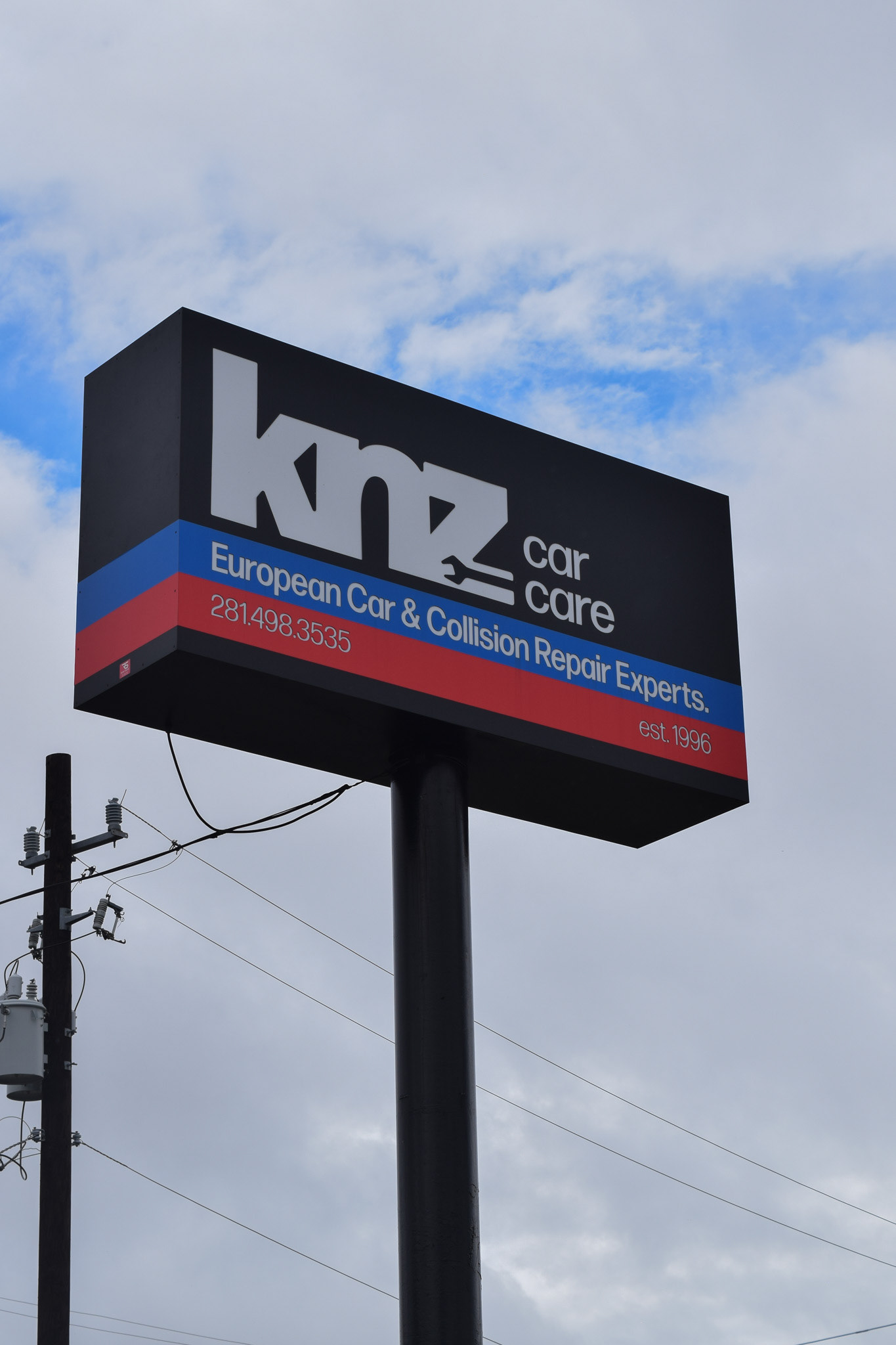
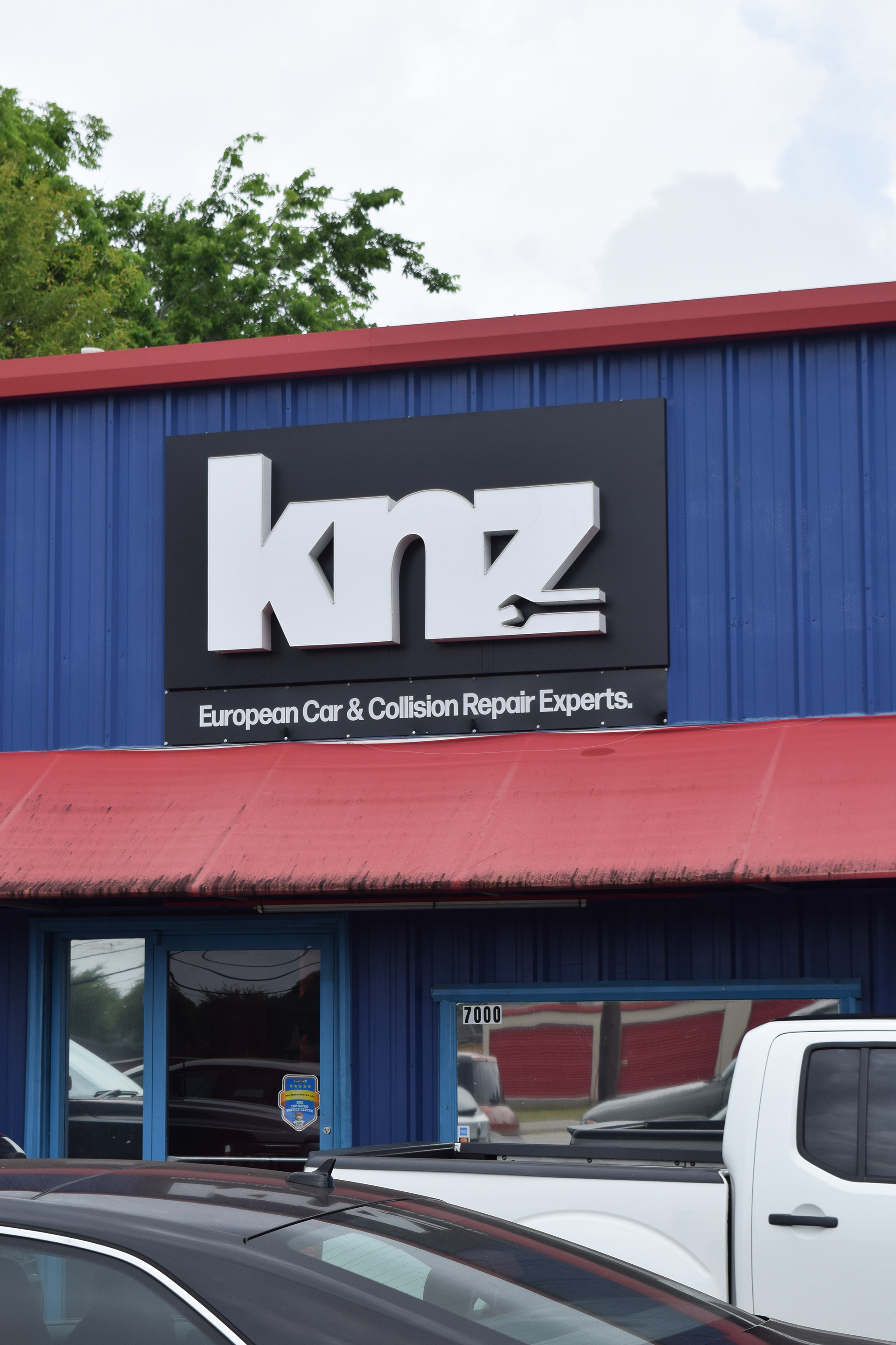
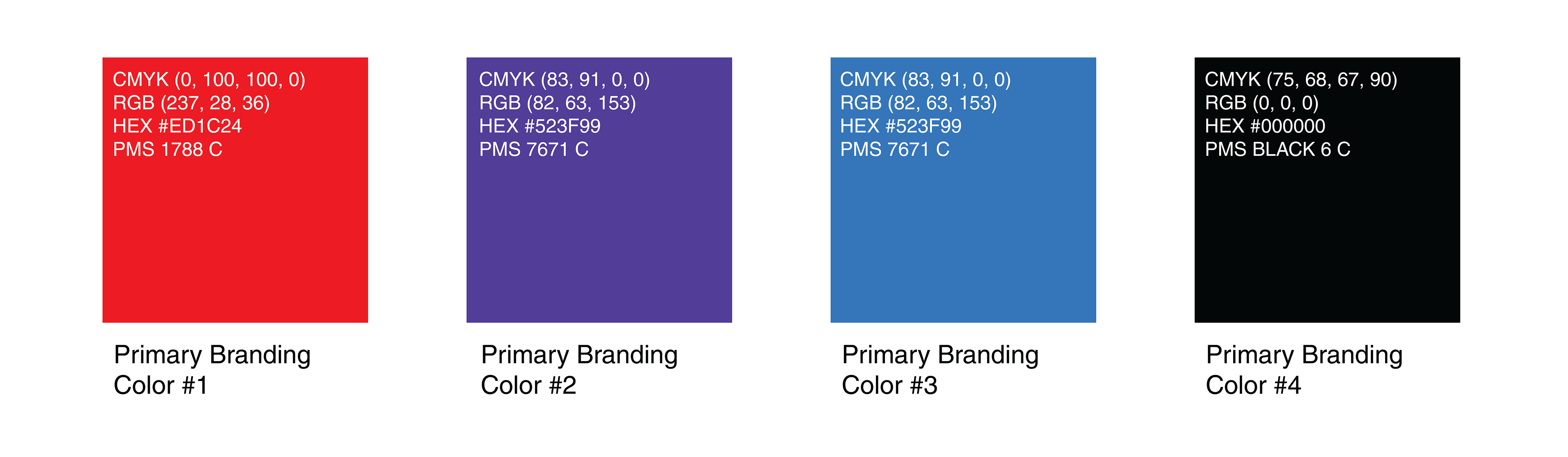

The KNZ Car Care branding emphasizes clarity, expertise, and trust. These qualities are central to their new identity as a specialized European auto care provider. The bold primary typeface, Forma DJR Banner, paired with the Input Mono, communicates strength and modernity. A vibrant color palette of red (PMS 1788 C), purple and blue (PMS 7671 C), and rich black (PMS Black 6 C) reflects automotive passion, precision, and premium quality.
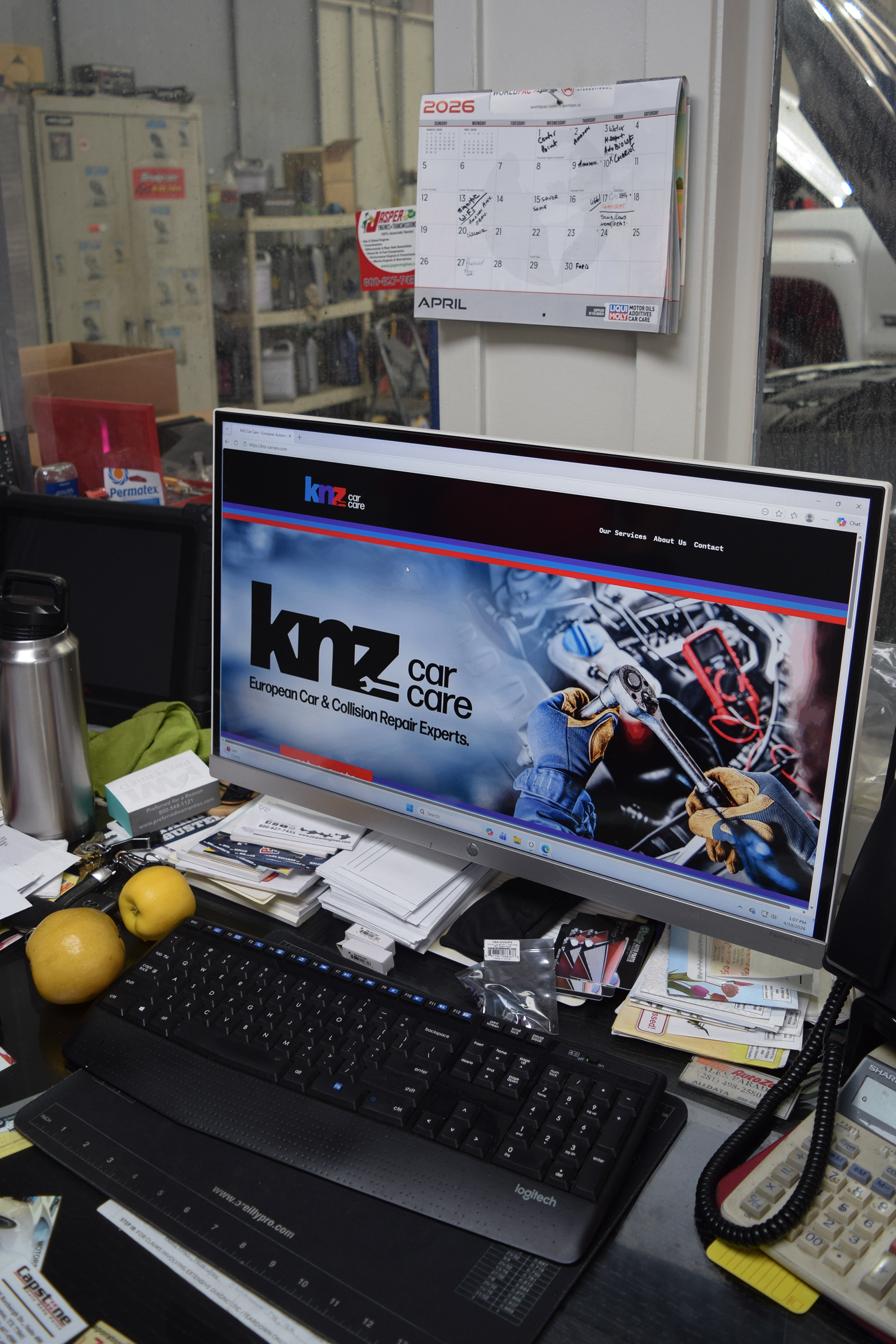
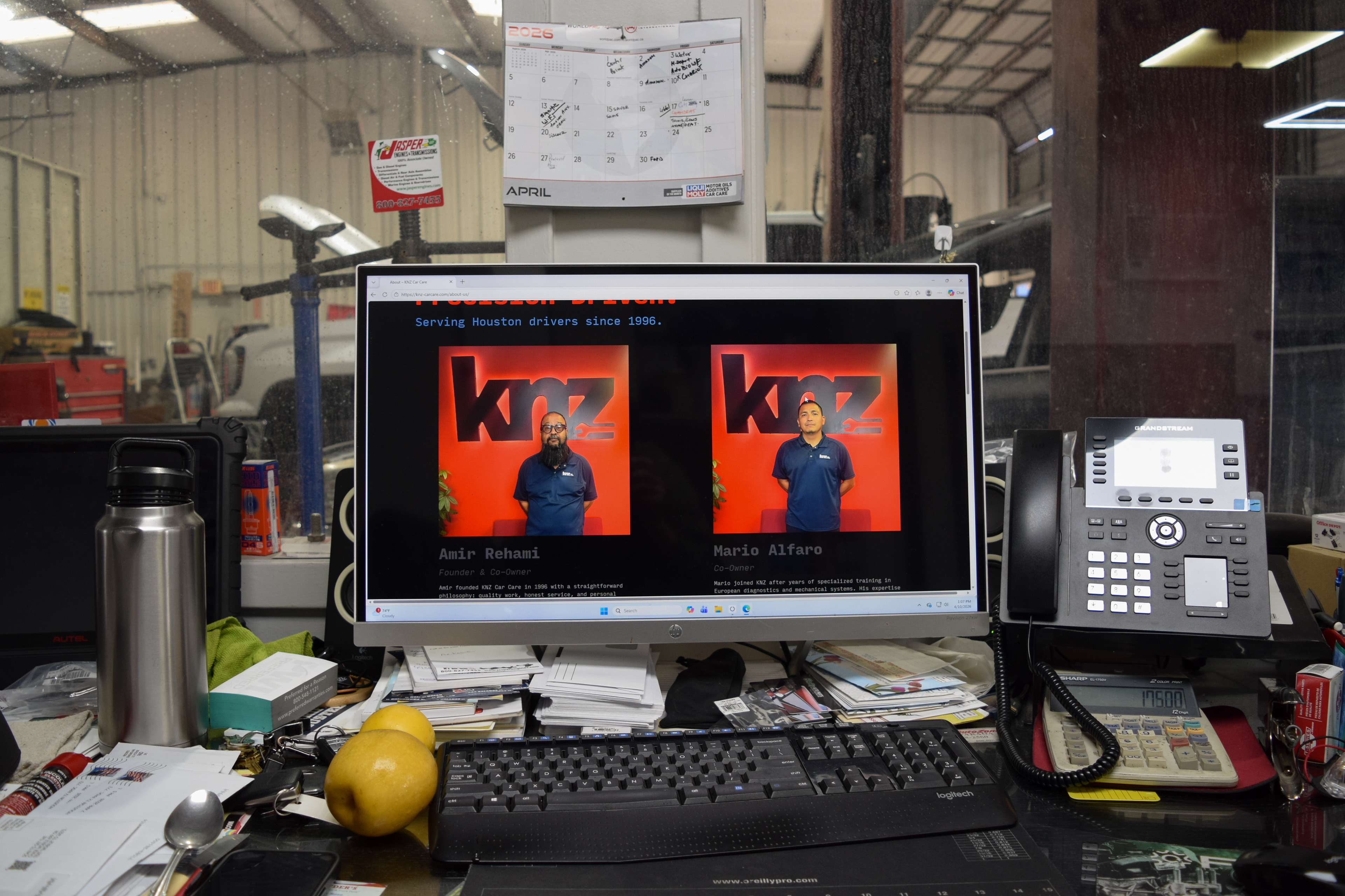
KNZ Car Care’s digital presence was designed to reflect the same level of precision and trust found within the shop itself. The website combines strong typography, clear hierarchy, and direct messaging to create an experience that feels dependable, approachable, and professional. Built around accessibility and clarity, the interface prioritizes quick service navigation, transparent communication, and a visual language rooted in the company’s established identity.
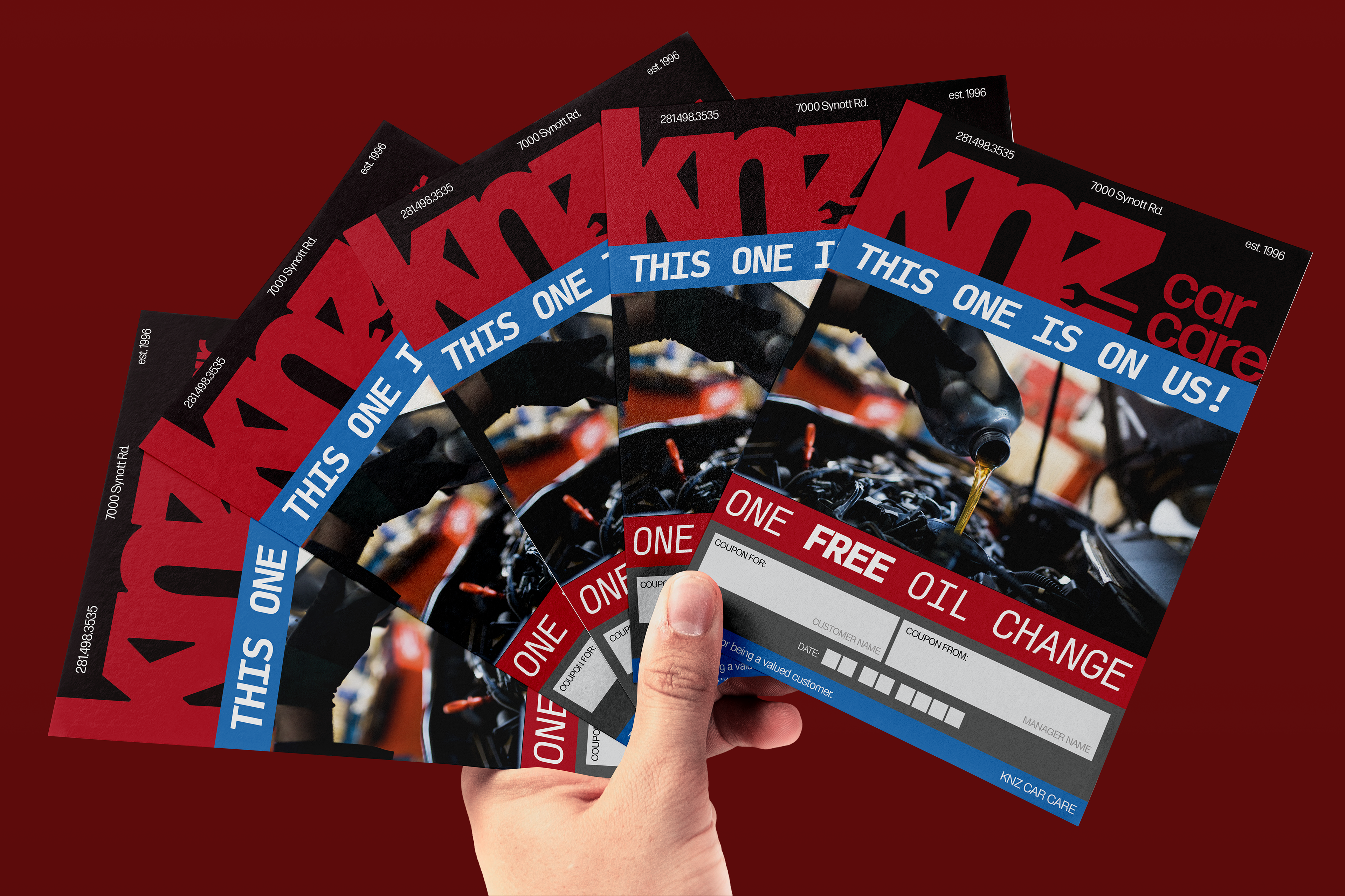
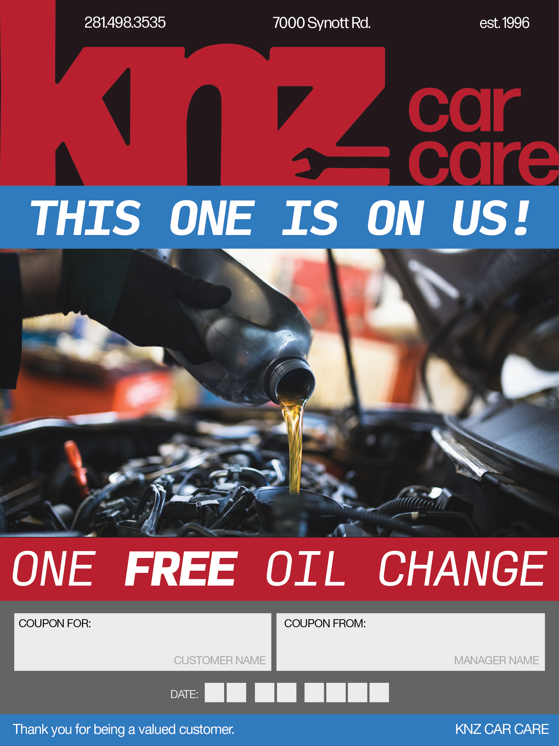
The printed materials extend the KNZ identity into tangible customer touchpoints. Service cards, promotional mailers, and oil change vouchers were designed to feel bold, memorable, and functional while maintaining consistency across the system. Through strong color blocking, high-contrast typography, and recognizable branding elements, the materials reinforce trust and increase visibility both inside and outside the shop environment.
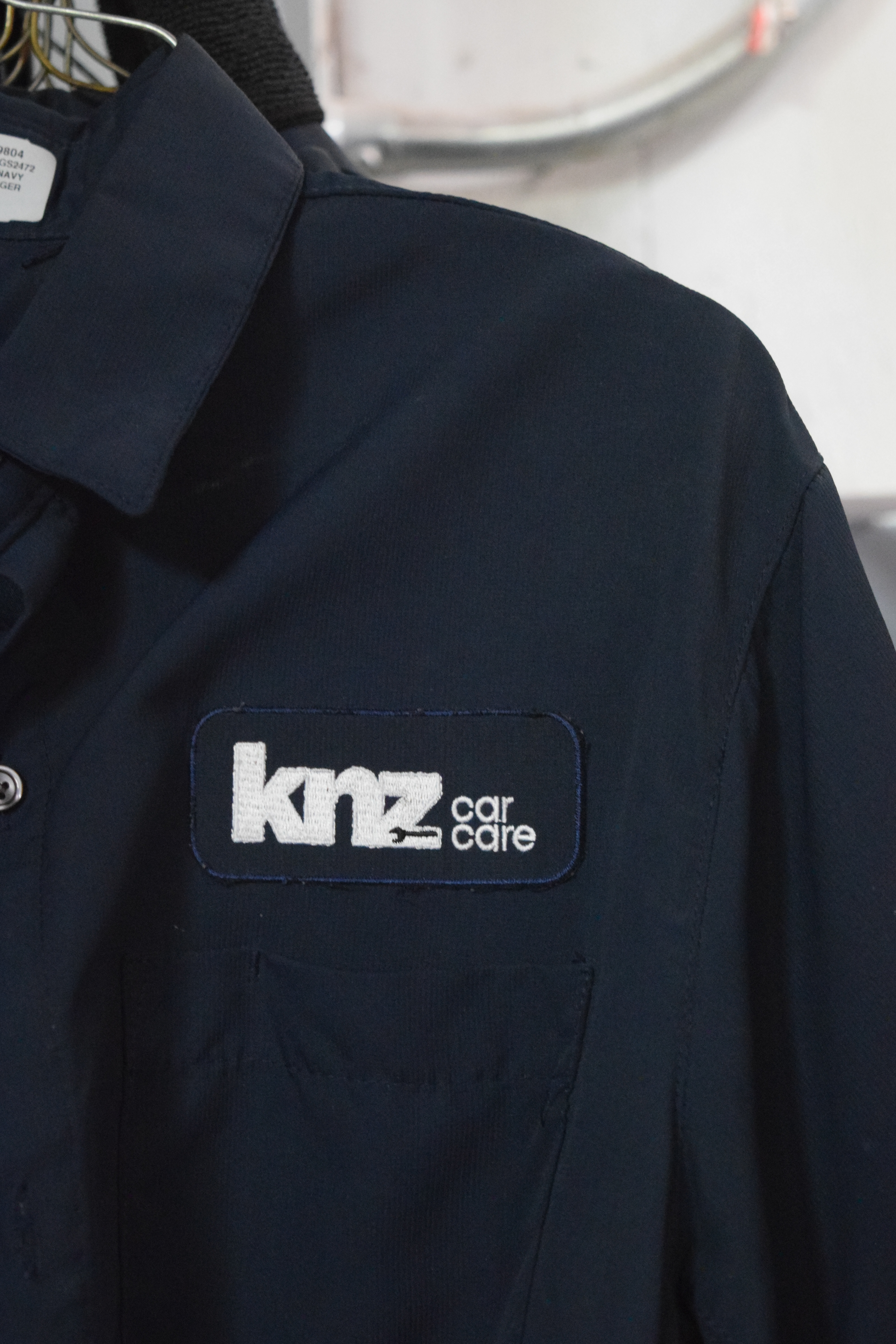
Employee uniforms were developed to strengthen professionalism and create a cohesive customer-facing experience. The embroidered branding system emphasizes durability, clarity, and recognition while remaining understated and practical for everyday shop use. By integrating the identity directly into staff apparel, the brand becomes part of the service experience itself — reinforcing consistency, accountability, and team presence.
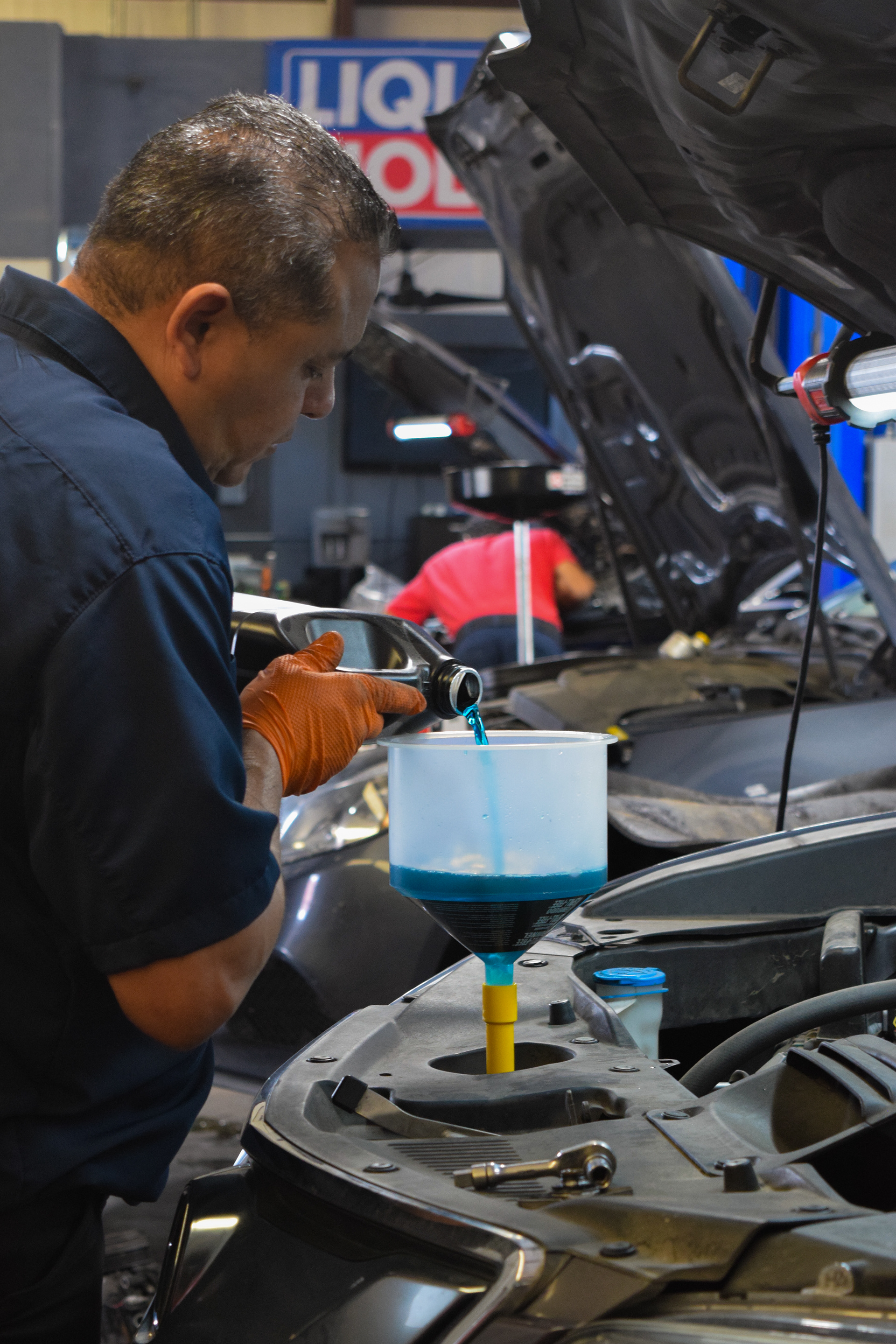
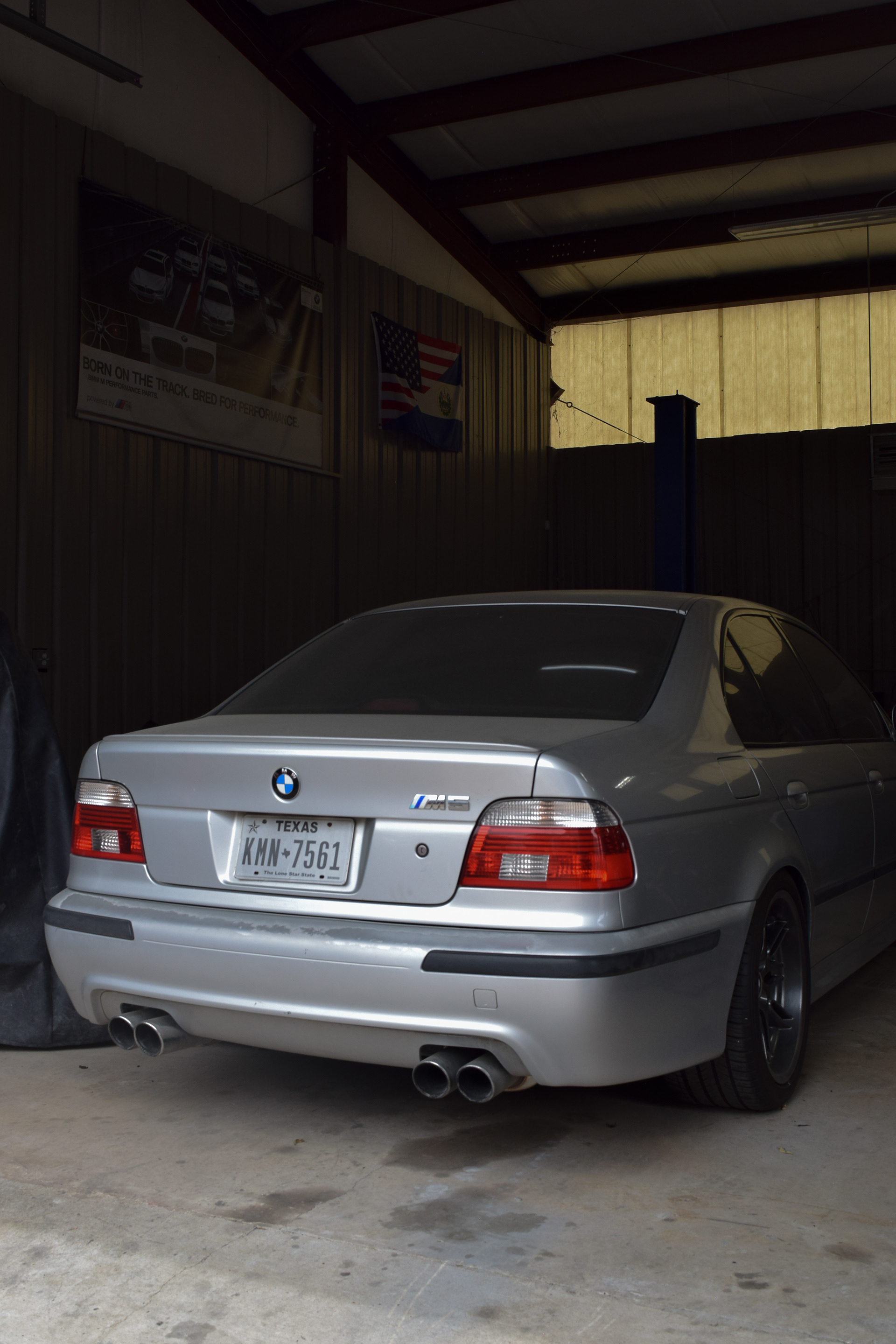
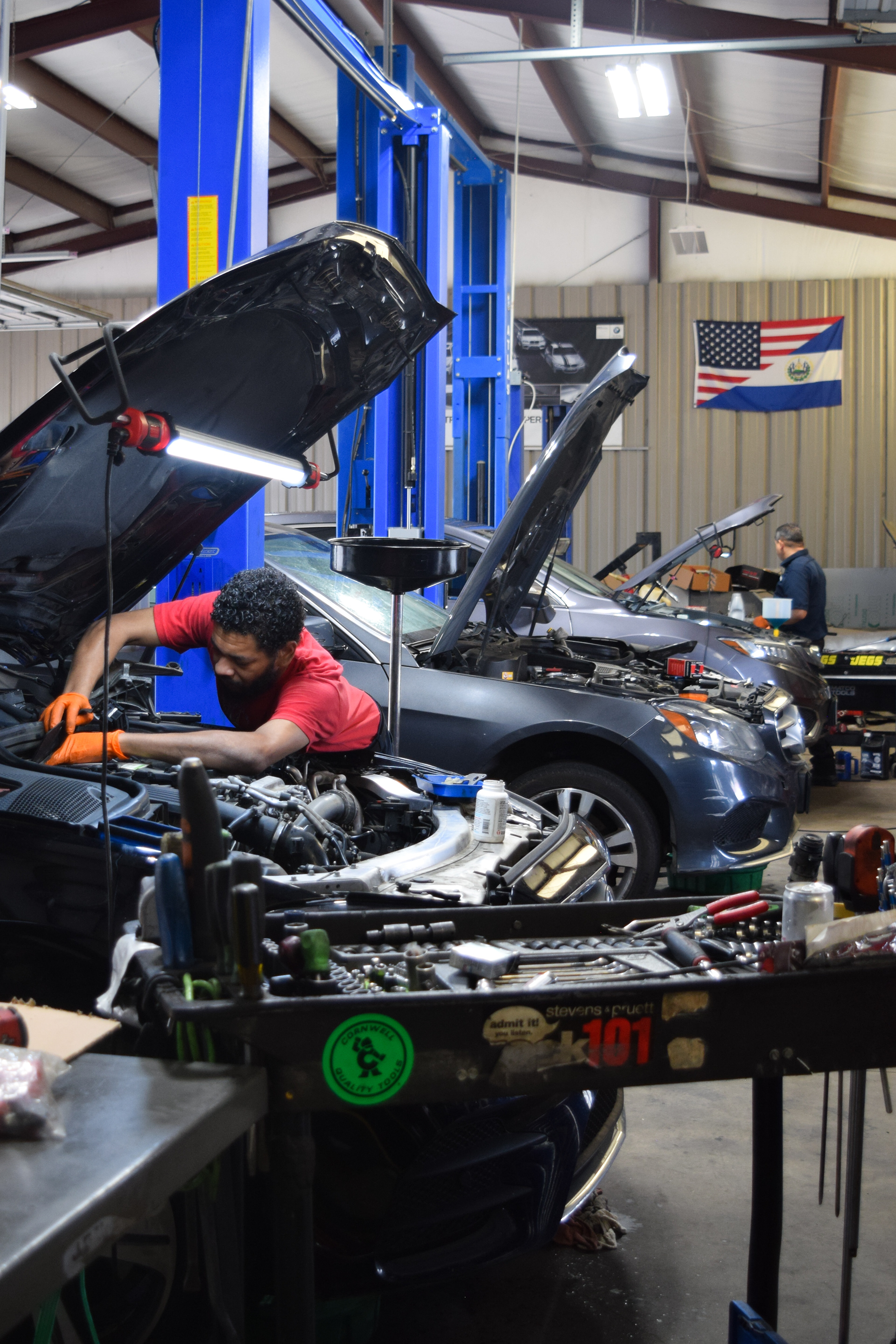
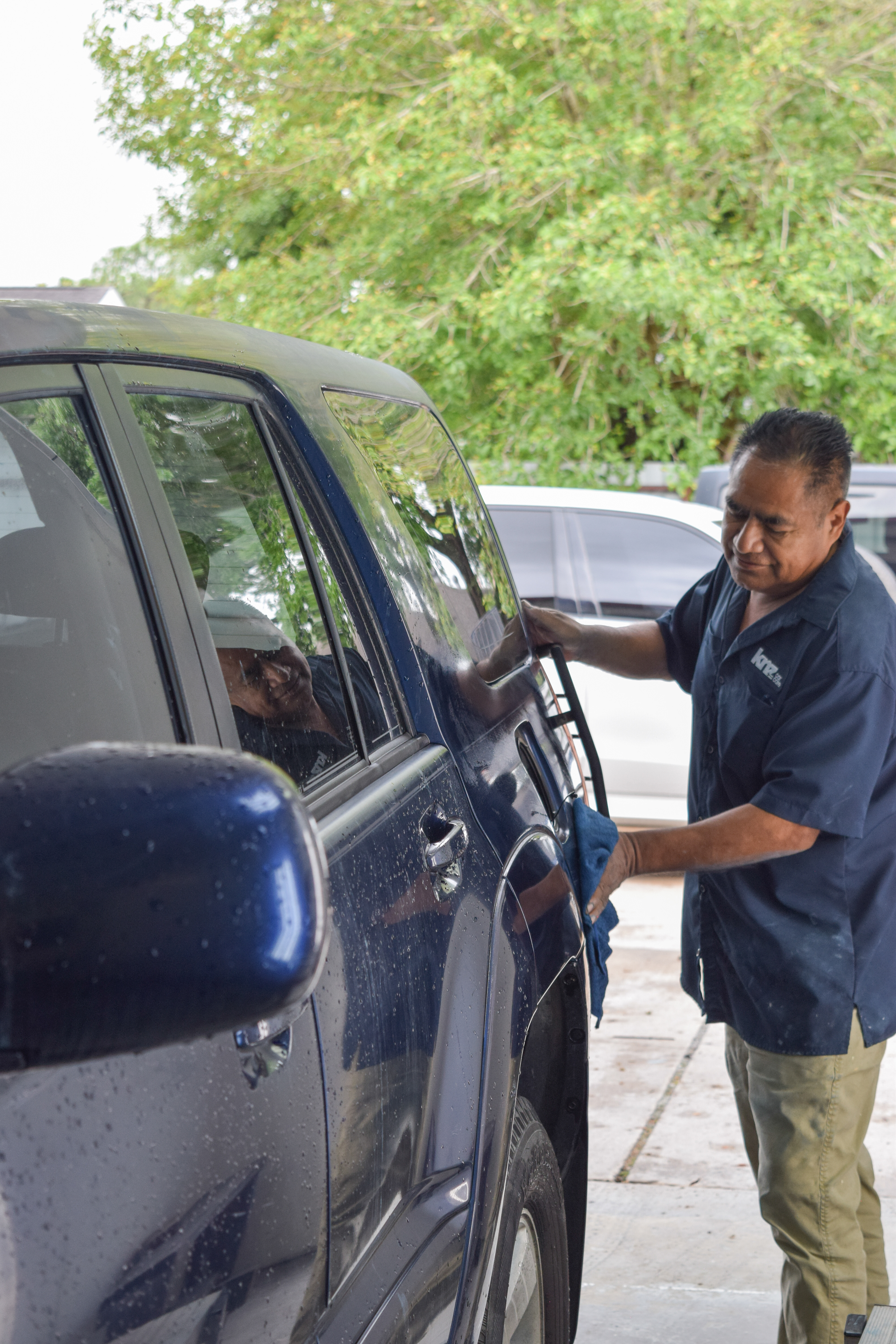
The photographic direction focuses on authenticity, craftsmanship, and the daily rhythm of the shop environment. Rather than relying on staged imagery, the visuals highlight real technicians, real vehicles, and genuine moments of labor and precision. This documentation-driven approach reinforces KNZ Car Care’s reputation as a hardworking, family-operated business built on experience, trust, and attention to detail.